7 Effective Mobile Design Practices To Boost Customer’s Interaction With Brands
When you outline your business website for mobile, you can boost the customer’s interaction with your brand.

Quality customer interaction with your brand is the most important thing for your business. It brings the customer closer. When we talk about delighting customer, it may sound like the inbound marketing methodologies. Designing may not be a part of inbound marketing, but it has a significant role in enhancing it.
Today, most of the users prefer using mobile for browsing the internet (The stats show over 50% of people now use mobile devices for search queries). What do we learn from it?
The answer is simple. You must plan business website according to mobile devices. It is what we will cover in this post. You will understand how you can design your website for mobile devices. When you outline your business website for mobile, you can boost the customer’s interaction with your brand.
So, without further ado, let’s get you started,
Get the Best Updates on SaaS, Tech, and AI
There Is No “One Size Fits All” Concept

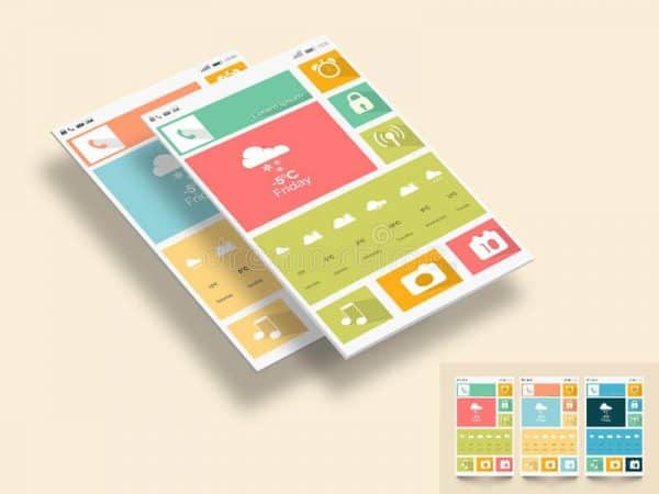
Mobile devices come in various shapes and sizes. You must keep all these physical constraints in mind. There are different platforms, iOS, and Android devices. While designing your website, you must keep this in mind that both the platforms. Both have different navigation style, interface, and functionality.
For instance, an iPhone has a single multifunctional button while an Android device has multiple buttons for various functions. In a nutshell, both require a different approach to planning and designing.
In addition to that, the screen sizes also play a crucial role. You must cover all the screen sizes. Make it responsive so that it may perform at its best even on the smallest of the screen. You must keep these physical constraints in mind while strategizing the design.
Think of Yourself as A Visitor

It is one of the best practices while designing a mobile layout. Most of the elite designers tip it off that they create the website as a visitor, not as a designer. The success of any design is not when the design is unique and enticing it is successful when your visitor likes it and find it easy to use.
It is the most basic but one of the most crucial things. As a designer, you must understand that you are designing the website for your user. Think about how they will operate your site on their device, do they like the design, will they be delighted with the experience, and was navigating was easy for them or not.
Questions like that will help you to understand the real requirements for your design. See it through the eyes of your visitors and design it right.
Keep It Minimal

Minimalist design is very crucial nowadays. No one likes a mobile site crowded with options. Remember one thing, limit the use of design elements to make your mobile website simplistic.
A simple approach is always engaging. Don’t confuse your audience with loads of design elements and CTA buttons. It will overwhelm them resulting in higher bounce rate of your mobile website.
Give your visitors some space to breathe, or they will suffocate and leave your website for good.
Use Color Accordingly

Color is the most vital element in web designing. When you need to distinguish several options, color is the element that differs them. The story doesn’t end here. There is more to it. According to the color psychology,
“Red is the most powerful choice that can increase your sales. Take a look at McDonald’s, KFC, Pizza Hut, and Coca-Cola. One thing that they have in common is that they utilize red as their brand’s color.”
Colors are known to be motivating, and when you combine them with their contrasting colors, they generate favorable results. In a nutshell, they have a deep penetration of the mind of a user. You should use it with caution.
Focus on The Special Gestures

Remember one thing buttons are not the only interactions on mobile devices. There are several others which will help your visitor to keep them on the site. The gesture is one of those elements. Nowadays, business website relies on gestures for elongated interaction with their users.
Let me tell you the story of Instagram. There was no zoom in-zoom out feature back in those days on Instagram. The standard gesture for zoom-in or zoom-out was pinching in or out. That was not present on Instagram. It creates a wrong impression on Insta in those days. Lucky for them, they address this issue, and after that, the user experience is much better.
When you introduce gestures features, make sure that you are aware of the standard gestures used on mobile apps and sites. There are many gestures which might not work on your Android phone but works fine on your iPhone. Adding animation can enhance value and engagement with the gestures. The choice is all yours.
The Hand-To Screen Conundrum

When you design a mobile site, put your viewer’s physical comfort into consideration. Do they feel any strain on their fingers? Try your website as a user and see for yourself. Another thing of concern is the size of the button. Even a slightest up and down can make your user uncomfortable with your mobile website.
Content viewing area, the size of buttons, and text boxes are the elements that can make or unmake the UI of your mobile website. Keep everything in mind including things like the size of your user’s fingers and screen sizes.
Keep A Close Eye on The Feedback

You create a mobile website with all the features and visuals. Now, it is time you check whether it is working or not. What is the best way of reviewing it? You made the website for the users, why don’t you ask them about it.
Feedback from your visitors is the best way to improvise on the points that need improvements. You must create a section where you ask your user to share his/her experience to get the idea of how good or how bad your site is. It will help you in enhancing the UI of your users and increasing the reliability of your website.
Winding It Up
Let’s summarize the points you studied in the post to make sure that you understand these basic tenets of mobile designing.
- Mobile devices come in various shapes and sizes. You must keep all these physical constraints in mind. There are different platforms, iOS, and Android devices. Make it responsive so that it may perform at its best even on the smallest of the screen.
- Most of the elite designers tip it off that they create the website as a visitor, not as a designer. The success of any design is not when the design is unique and enticing it is successful when your visitor likes it and find it easy to use.
- Minimalist design is very crucial nowadays. No one likes a mobile site crowded with options. Remember one thing, limit the use of design elements to make your mobile website simplistic.
- Color is the most vital element in web designing. When you need to distinguish several options, color is the element that differs them. Colors are known to be motivating, and when you combine them with their contrasting colors, they generate favorable results.
- Buttons are not the only interactions on mobile devices. There are several others which will help your visitor to keep them on the site. The gesture is one of those elements.
- Content viewing area, the size of buttons, and text boxes are the elements that can make or unmake the UI of your mobile website. Keep everything in mind including things like the size of your user’s fingers and screen sizes.
- Feedback from your visitors is the best way to improvise on the points that need improvements. You must create a section where you ask your user to share his/her experience to get the idea of how good or how bad your site is.
I hope that you like the post. Did I miss something? Let me know via comments, and I will get back to you as soon as possible. Till then, have a wonderful day, ADIOS!!!
Morris Edwards is a web designer & Internet marketing strategist at Awebstar: a web design company in Singapore. He loves writing about new web design trends & share marketing idea about SEO, SMO, and SMM.
FTC Disclosure: The pages you visit may have external affiliate links that may result in me getting a commission if you decide to buy the mentioned product. It gives a little encouragement to a smaller content creator like myself.


