The Mobile Customer Experience in 2019 & How to improve it
User experience plays a vital role when it comes to mobile devices. It requires a lot of planning, detailing, and analysis to make the website mobile-friendly and to avoid issues in the future. According to a recent survey, it is found that if your website is not mobile-friendly, 50% of the users will use it less even if they like your business or brand. Moreover, 52% of the users believe that poor mobile user experience makes them less likely to engage with the company!

You have invested a lot in setting up your website, you are getting fairly enough business, and you are happy with! But have you ever given a thought whether your custom website design solution has a mobility quotient? Maybe your website is designed keeping in mind the user experience for the conventional browsers, but you might be overlooking UX for the mobile audience.
User experience plays a vital role when it comes to mobile devices. It requires a lot of planning, detailing, and analysis to make the website mobile-friendly and to avoid issues in the future. According to a recent survey, it is found that if your website is not mobile-friendly, 50% of the users will use it less even if they like your business or brand. Moreover, 52% of the users believe that poor mobile user experience makes them less likely to engage with the company!
So, how you can make the user interface and user experience solutions work hand-in-hand? Well, in this post, we are going to explore a few key elements that will make your UX/UI solutions works smoothly on all screens.
Get the Best Updates on SaaS, Tech, and AI
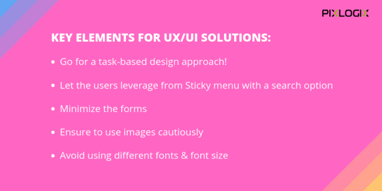
Go for a task-based design approach!
While designing UI/UX solutions for the mobile audience, it is important to first understand what things will be done frequently on your website by mobile users. Make a list of all such things, and make those things available for mobile users to optimize the mobile UX at first! If someone comes to your website using a mobile phone, it is important that you make things available for them and helps them complete things they want to do on the go.
Let the users leverage from Sticky menu with a search option
One of the crucial elements that can make or break the user experience in web UI/UX design services is the search option. While designing for better user experience on mobile devices, you should empower the users to search anything they want right from the home page itself. You can make the search option available using the sticky menu on other pages of a website while ensuring that the search result pages look awesome.
Minimize the forms
We are talking about user interface and user experience solutions for mobile devices and therefore it is crucial that we understand the limitations of the mobile users. No one will ever like to fill out that long form when they are using a tiny device. It is important that you understand mobile user preferences and design forms in such a way that will help them complete it with minimum information and ease.
Ensure to use images cautiously
Mobile devices are coming in different shapes and sizes, and are having entirely a new dimension to communicate with the users. It is always important that you convey your points using a variety of images, but the only problem is that it will take a lot of time to load. Ensure that you follow the industry-best practices managing server-side and client-side hurdles and optimize images properly to give smooth user experience.
Avoid using different fonts & font size
When we talk about UX/UI solutions for the mobile devices, it is vital to focus on font types and font sizes. You can’t just use all the desktop font sizes and styles for your mobile website. With the tiny screen size, using different styles and different sizes of fonts will make the GUI look messy and cluttered. It will make difficult for the users to keep their eyes on the website page. Hence, always try to use a uniform font style and size keeping in mind the size of the mobile screens for your custom website design solution.
Wrapping Up

When we talk about user experience for mobile devices, it is always crucial to pay attention to correct the basics first with the help of Web UI/UX Design Services. However, the most important thing is to test your website for the user experience, get the feedback, apply the changes, and test again. There are a lot of ways through which you can see whether you really need to work on your website to improve the user experience for mobile devices or not. Just get the pain points identified and start working on it by following the tips mentioned above.
Do you have more things to share to improve the user experience for the website?
FTC Disclosure: The pages you visit may have external affiliate links that may result in me getting a commission if you decide to buy the mentioned product. It gives a little encouragement to a smaller content creator like myself.


