
Designing Your Website Using Color Psychology
In this article, we are going to take a look at various colors in further detail to give you a better understanding of color psychology in terms of web design.

When designing a website, there is a lot that needs to be considered. From the layout to the graphics used, every element comes together to create the right user experience and overall image of your brand.
One element that needs a lot of consideration is the colors you use. Most site builders will give you the ability to choose from a huge assortment of templates, with varying color schemes. How do you select the right one for your business and target consumer base? Below, we are going to take a look at various colors in further detail to give you a better understanding of their impact in terms of web design.
Get the Best Updates on SaaS, Tech, and AI
White
Firstly, we have white, which is a color associated with simplicity and purity. It is a common choice for websites, as you can’t go wrong with white and it works well alongside a huge spectrum of shades.
Black
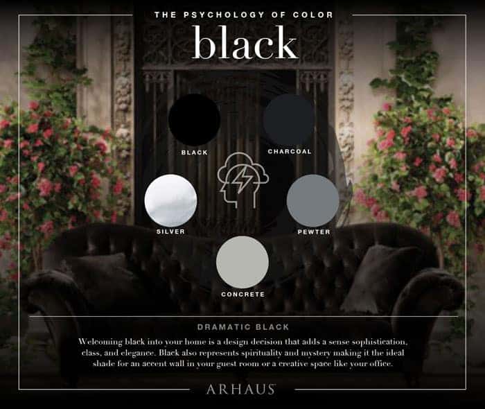
On the other side of the scale, we have black. Black is powerful, bold, and serious. It can often be used to draw attention, as black against white is the ultimate contrast. You will find that a lot of technology websites and luxury brands, including auto websites, use large quantities of black to portray a serious, high-end tone.


Green

What about green? Well, green is associated with nature and health. It is also the color of the environment. It can create a harmonious and safe environment for website visitors. If you want to create a sense of urgency, green is not a good choice. If you want to create a feeling of positivism, safeness, and security, green works well. Green is often used for health-related websites, as well as companies operating in industries such as recycling.
Blue
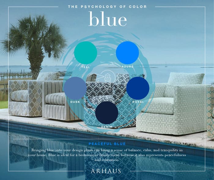
Blue is the ultimate color of trust and professionalism. This is why it tends to be used by finance-related companies. From life insurance to pension providers, a lot of these businesses have used blue as the main color on their website
Red
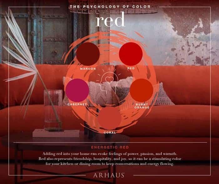
Next, we have a red color, which is a bold and passionate color that creates a sense of urgency. This is why you will often see “sales” signs in red. It grabs your attention. Because of this, too much red can be overbearing. Plus, it gets the heart racing too! Instead, you need to use red strategically to draw attention to certain parts of your website. Red is a great color in terms of encouraging impulse buys.
Yellow
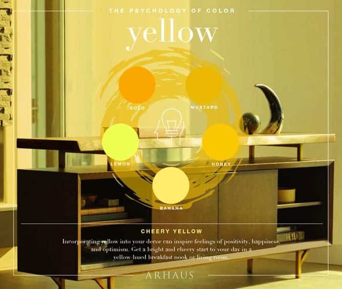
Finally, we have yellow, which is a color associated with happiness and optimism, as well as creativity. If you are trying to invoke a happy and bright response from your website visitors, yellow will make them feel energized and also intrigued. Stay away from the yellow text, though, as it is incredibly difficult to read – even if it is on a black background!
Negative and positive emotions associated with each color
Color makes us feel a certain way. This is why color psychology is so important in web design. So, let’s take a look at the positive and negative emotions associated with each color to give you a better understanding…
Blue
- Positive – calm, reflection, coolness, logic, duty, serenity, efficiency, trust, communication, and intelligence.
- Negative – Unfriendliness, lack of emotion, aloofness, and coldness.
Green
- Positive – peace, equilibrium, environmental awareness, reassurance, restoration, rest, universal love, refreshment, balance, and harmony.
- Negative – enervation, blandness, stagnation, and boredom.
Violet (or Purple)
- Positive – authenticity, luxury, vision, containment, and spiritual awareness.
- Negative – inferiority, suppression, decadence, and introversion.
Red
- Positive – excitement, masculinity, stimulation, basic survival, energy, warmth, strength, and physical encouragement.
- Negative – strain, visual impact, aggression, and defiance.
Yellow
- Positive – creativity, friendlies, emotional strength, extroversion, self-esteem, confidence, and optimism.
- Negative – anxiety, depression, emotional fragility, fear, and irrationality.
Pink
- Positive – sexuality, love, femininity, warmth, survival of the species, nurture, and physical tranquility.
- Negative – physical weakness, emasculation, emotional claustrophobia, and inhibition.
Black
- Positive – substance, efficiency, emotional safety, security, glamour, and sophistication.
- Negative – heaviness, menace, coldness, and oppression.
White
- Positive – efficiency, sophistication, simplicity, cleanness, purity, clarity, sterility, and hygiene.
- Negative – elitism, unfriendliness, barriers, coldness, and sterility.
Take a look at the emotions related to brands
Color palettes
Of course, you do not merely need to consider the impact that different colors have, but you need to think about how you are going to use these colors. Color palettes can generally fall into one of the following categories:
- Triadic – This involves using three colors that are evenly spaced around the color wheel.
- Complementary – This palette is created using two colors that are located opposite one and other on the color wheel. The high level of contrast makes this work well.
- Split-complementary – This is similar to complementary. However, instead of using one set of colors opposite each other, two sets are used.
- Analogous – This means using colors that are sat next to each other on the color wheel.
- Monochromatic – This is the term used to describe tints or hues from a single color being used.
Understanding the meanings of colors on the branding perspective

As you can see, there is a lot that needs to be considered when it comes to website design and the colors that are used. We hope the information that has been provided in this blog post will help you to build the perfect website for your brand and target consumer. Remember, you really need to think about the impact the color is going to have on the person’s feelings and actions when they visit your website.
FTC Disclosure: The pages you visit may have external affiliate links that may result in me getting a commission if you decide to buy the mentioned product. It gives a little encouragement to a smaller content creator like myself.