You are running your business, a full-featured website, and a fantastic landing page, but still no lead or conversion why? Have you ever thought of diving deep into such thoughts? Yes, but we know that the answer is still the same, a big Why?
The answer is “Call to Action”, the most important and appealing factor of an unbounce landing page is CTAs and if you are focusing on other things then the results will be the same. That’s the reason, we use to tell the marketers to redefine their phrases and ideas. CTAs are a very powerful option through which you can easily convert your audience into a potential customer. No matter at what stage you are, you just need proper guidance and better learning to hit the pedal.
Various CTA(Call to action) that you use to call out your audience:
As you can see below that we have listed CTAs with some popular company names who are using it and receiving a good lead conversion.
Sign up
Through sign up, you call the audience for,
- Free Trial
- Future Event
- Online Course
Evernote
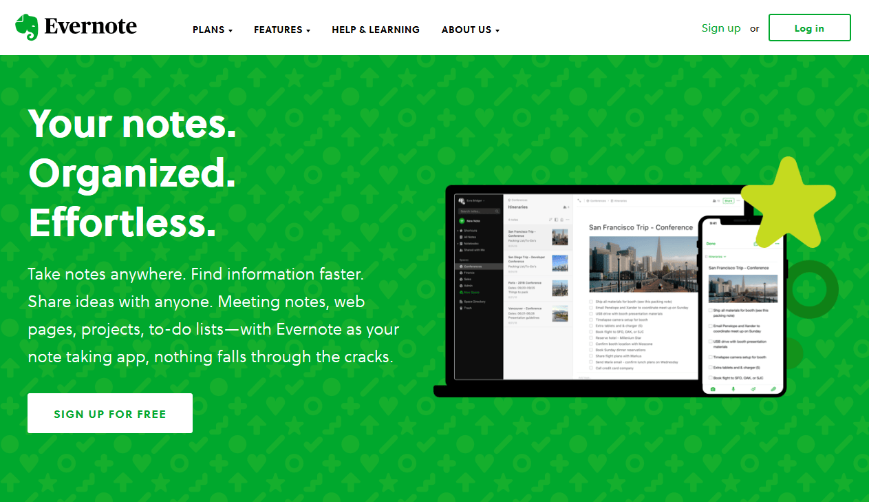
“Remember Everything”
If you have noticed then the first line of Evernote’s landing page gives you all the information about what it is. The information is clear and up to the mark. If you look to the website, you will find a minimalistic and simple design that makes it easy for the user to quickly recognizes the benefits of the application. It also provides you with an appealing sign up button. The green color of the Evernote logo with both CTA buttons makes the website more promising.
It depends on the CTAs context.
Subscribe
This CTA is commonly used to provide your customers with the company’s updates. If you want to increase your readership then ‘Subscribe’ is the ultimate CTA for you.
Officevibe
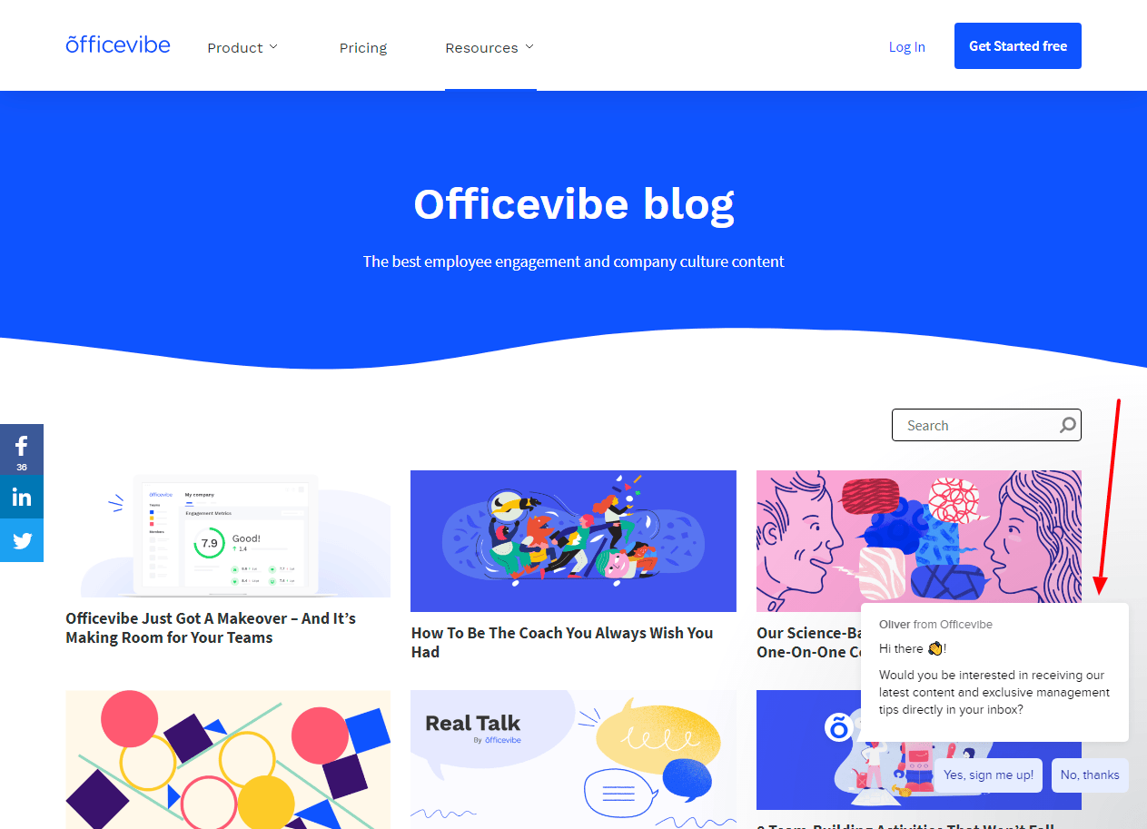
Officevibe’s slide call to action is not only attractive but makes it unique and different from others. When you scroll through their blog you will find a banner slid at the bottom of the page with a CTA to subscribe to their blog. But the best twist that makes it amazing is a copy that was written on the left-hand side of the CTA that reads – “Get our tips straight to your inbox, and become a better manager”. Once you collect a big email list then use it to promote your business.
This line appeals to the audience and I think they will love it.
Try for free
So, the free trial option is very popular in today’s world, this CTA will be used by such companies. It is used to provide a demo to their audience so that they can convert into their potential customers.
Netflix
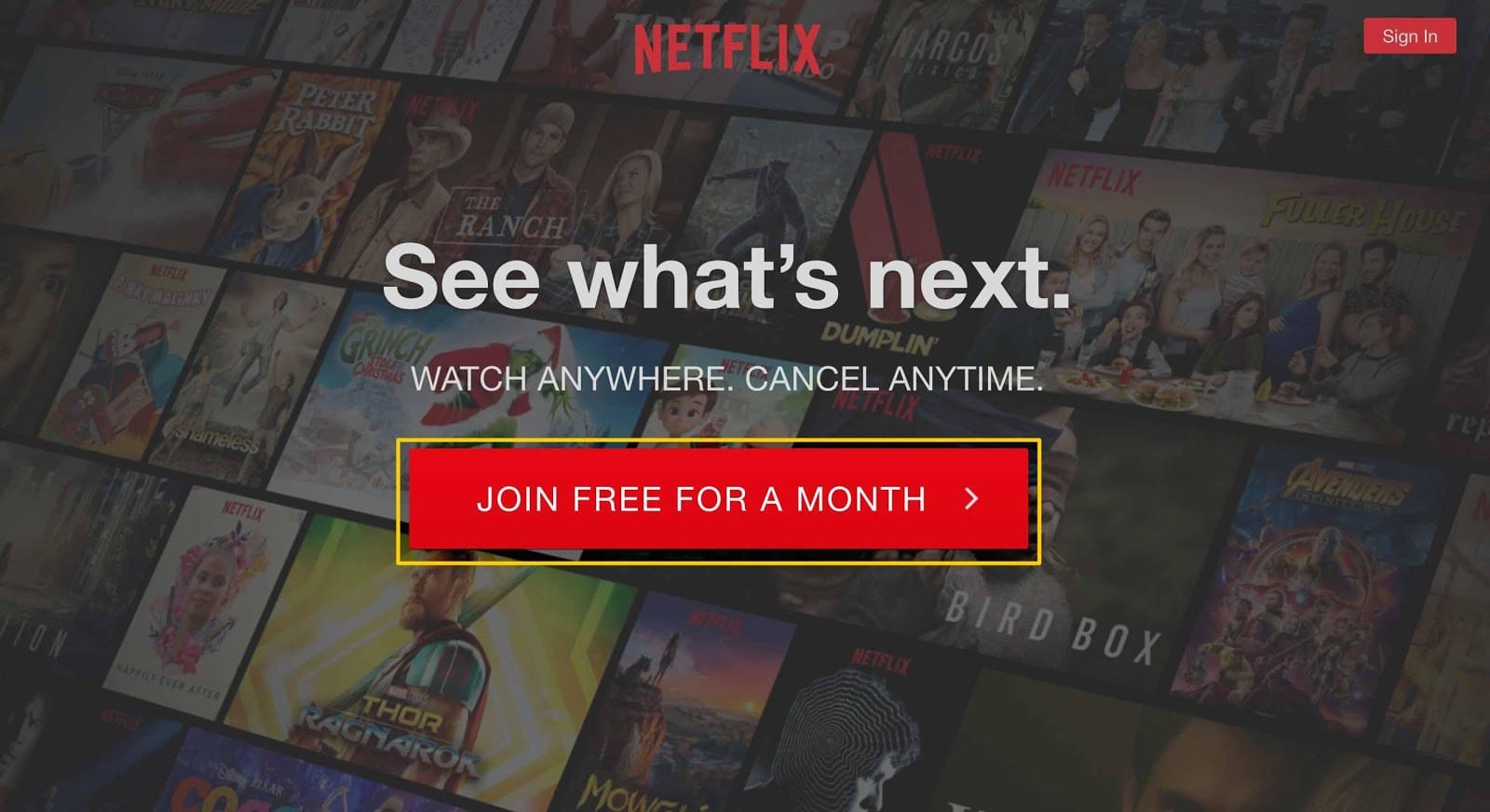
When the last time you signed up for a subscription and felt like a mistake? I know several times, but Netflix has a solution for it and it has used it most efficiently on the landing page. Netflix landing page copy reads “Cancel Anytime”, which is known as a deal-breaker for Netflix. And the twist is here “Join Free for a Month” and this is what positively affects the Netflix subscription. The red color of Netflix’s logo matching with its two calls to action button gives an attractive sense to their audience.
Get started
This CTA will provide you with a variety of behavior for the company. The company uses such CTAs through a free trial or virtual reality experience.
Square
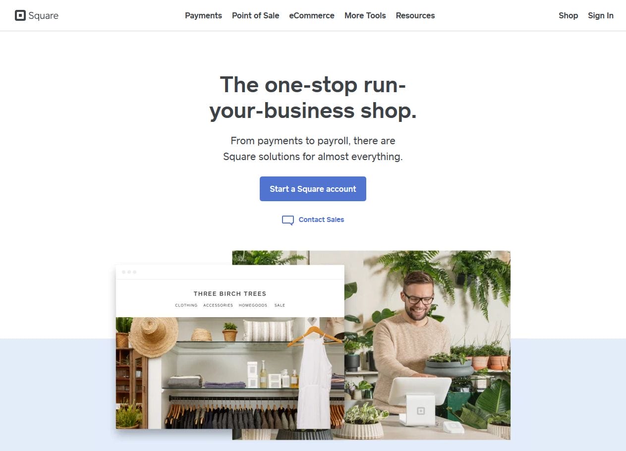
You need to consider several things other than the button itself to achieve all your goals. From background color, surrounding images, and surrounding text to making your copy unique is the ultimate solution for bringing the outcomes.
The team at Square used al these elements in making the best landing page by using only one image. As it says, “Simplicity is the key to success”
Here, the CTA “Get Started” gives a direct click to your mind to take action. If you look deeply, you will find out that the color of the credit card in the image and color in the CTA is the same, which makes it clear for the viewer about their services.
Our Work
When a company wants to share the information of his past work done then “Our Work” call to action is used. When you don’t aim for selling something rather you want readers to know more about you then you can use this CTA.
Full Bundle
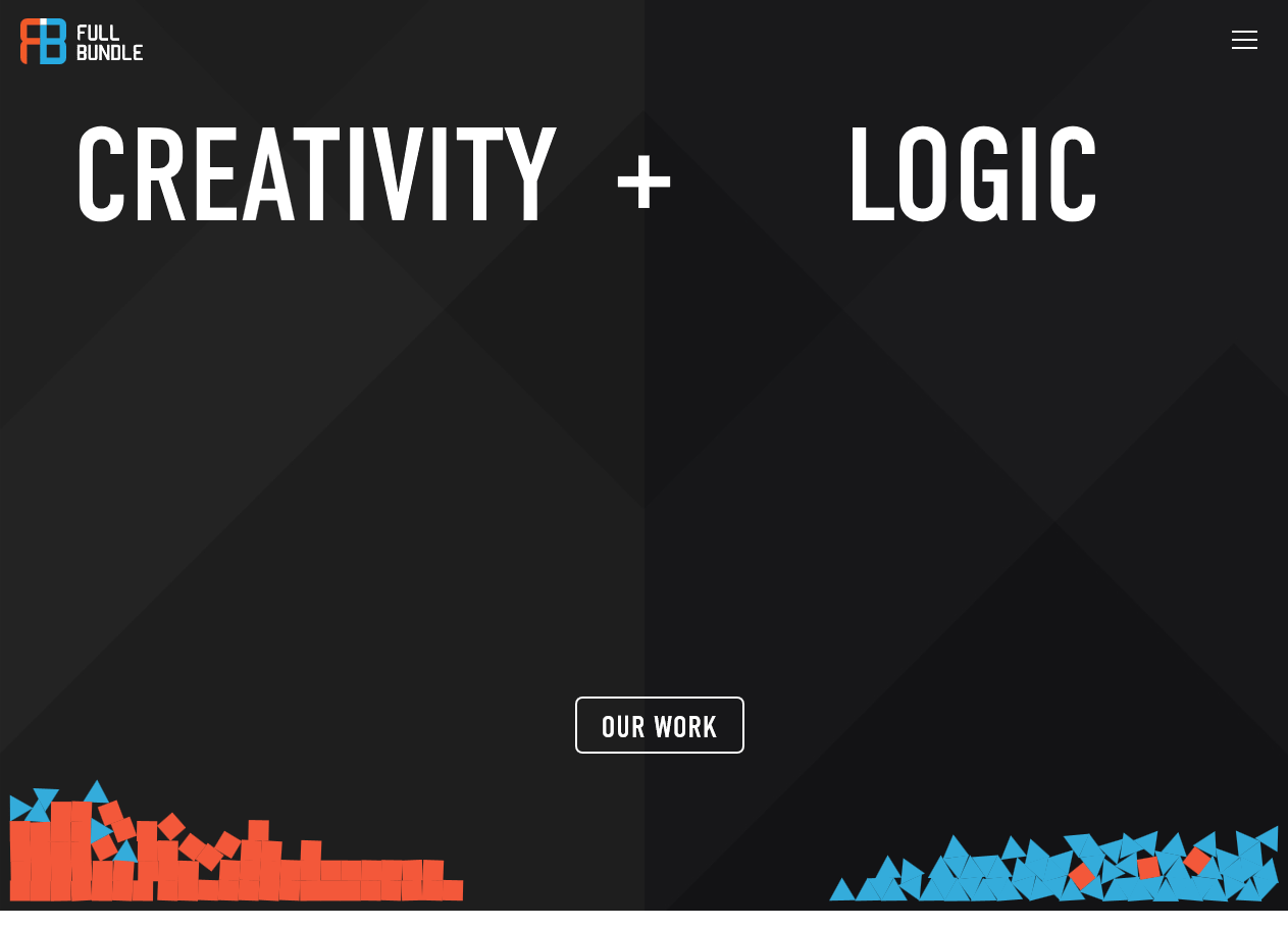
Full Bundle also opt for negative space to make their landing page looks promising and appealing so that people will click on CTA. The dark grey background gives a contrast effect to the white call to action button, which makes it look more Minimalist design. Their CTA clearly depicts that they initially want to build their repo in the market and want their clients to know more about their business strategy.
Wrapping Up
As no proof proves the success of the above discussed CTA buttons, but their popularity and numbers make it the ultimate example to understand. We hope that the above discussed CTA in-depth review will help you to make your unbounce landing page successful.
You just need to focus on things such as background color, surrounding images, surrounding text and copy that appeals to the audience to click on your CTA and buy your services. Poor CTAs can hurt your organization’s structure and sales so make sure you give you the best in making it successful.
Keep testing new CTA phrases to engage your audience so that they convert faster. CTAs are the ultimate solution that can increase your sales if you are using paid digital marketing.
All the best for your next campaign.
