The success of your website depends on the conversions. A poorly optimized online conversion form will not bring any sizable profits unless you do something to improve it. Thankfully, optimization is not something that is based on assumptions but rather actions and effort.
If you’re committed to increasing your conversions, you know the stats are against you. According to The Remarketing Report from SaleCycle, more than 70 percent of online customers abandon their orders. This is a nightmare for entrepreneurs because they need many more people to fill out that form.
With these ten simple but effective tweaks, let’s boost your conversion rates by 8 percent.
Get the Best Updates on SaaS, Tech, and AI
1. Don’t request a lot of information
Many conversion forms require online shoppers to provide various information such as email, name, address, and interests. A lot of fields can simply be too much to fill out, and why does one need so much information?
Ask yourself whether you need that particular field. If it’s not vital, then remove it.
2. Improve loading time of your pages
Every online business loses potential customers if its site is slow-loading. Take it from Amazon: the company conducted a study that produced amazing results. For example, one in four visitors abandons a website if it takes over four seconds to load—just four seconds!
The impact of a page load slowdown for Amazon was estimated at a whopping $1.6 billion in sales losses.
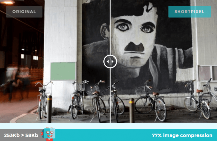
Use a website speed checker like Pingdom and get to know the average load time of your pages. If it exceeds 4 seconds, then it is most of the time because of non-optimized images. ShortPixel Image Compressor can do this automatically when you publish your blog post or website. You can see the dramatic difference by using it.
You can also optimize images by scaling them using Tiny PNG service and improve CSS with tools like CSS Compressor.
3. Free shipping
One of the most serious conversion killers is a shipping charge. Most online retailers consider it a ‘necessary evil’, and for a good reason. Free shipping is much more appealing to customers who want to spend less.
The stats back up this statement. High shipping costs and handling fees are considered as the leading factor that drives shopping cart abandonment in 36 percent of cases, according to this article on Rejoiner. That’s huge.
The takeaway here is obvious: organize free shipping for your customers.
4. Design a visible CTA
Improve the quality and effectiveness of your CTA buttons by following these simple recommendations:
- Insert action-focused text like “Claim Now.” Make
- Make it visible without scrolling
- Make it graphic
- Try both image-based and text-based versions
5. Eliminate forced registration
First-time customers want to buy the product. They don’t care about your business until they realize you are reliable. That’s why they will hate it when the site forces them to register to complete the purchase.
One in four customers leaves because of this unnecessary requirement. In other words, it’s a barrier that needs to be removed.
6. Include only the most relevant content
More content does not equal more sales. If a visitor encounters a lot of information above the fold, he or she might quickly become confused. This is an unresponsive design because the visitor might not need all of that information.
The most effective way is to provide content that fits above the fold, so there is no need to scroll down (the same applies to mobile-optimized sites as well). The quality of content is also an essential consideration, so many businesses hire professional writing services to write their texts.
7. Propose a free trial if a potential customer does not subscribe
This is a tweak used by many online businesses to attract customers. The idea is to allow to try the product or service without requiring credit card information. Online shoppers love that because you are not asking them to commit to testing.
8. Use a sticky header or footer
With mobile traffic already outperforming desktop traffic, online companies pay increasing attention to selling on mobile devices. One good way to increase conversions here is to add a sticky header or footer that contains a CTA button so the users do not have to scroll down to find it.
9. Include product videos
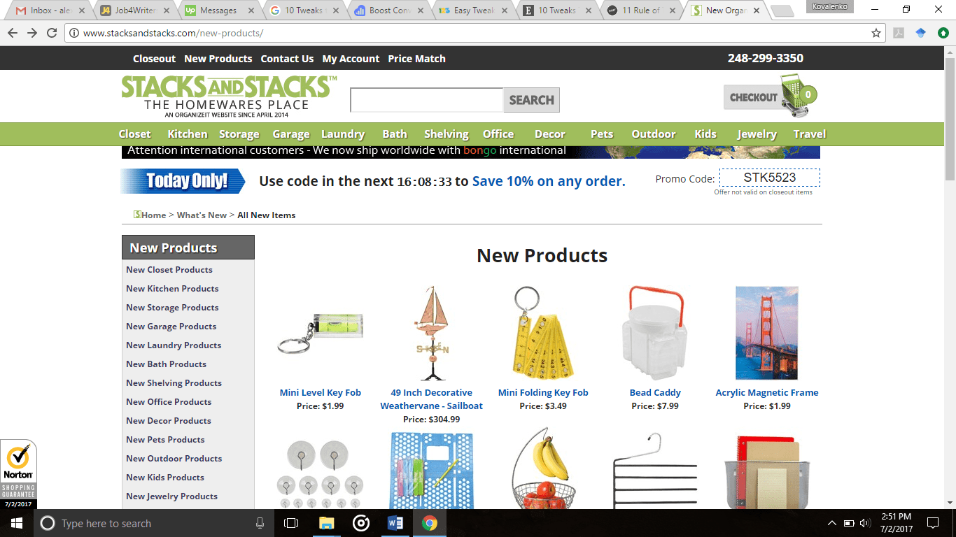
Online shoppers love videos. In fact, many companies reported increasing sales because of videos. For example, Stacks and Stacks claimed that their visitors were 144 percent more likely to buy a product after seeing its video.
10. Create a sense of urgency
Any experienced online marketer will tell you that creating a sense of urgency at some point is a must. Lines like “Only a few items left in stock” and “Hurry! Sale!” are very effective because they tap into deep psychological motivations. The urgency can cause a person to act quickly, thus affecting conversions.
Let the visitors know that there aren’t many items left or place a timer on a deal to create a sense of urgency.
Tom Jager is a professional blogger who works at Awriter. He has degrees in Law and English Literature and has written numerous articles for online journals. You can reach him on G+ or Facebook.
FTC Disclosure: The pages you visit may have external affiliate links that may result in me getting a commission if you decide to buy the mentioned product. It gives a little encouragement to a smaller content creator like myself.


